Bokomo Rusks
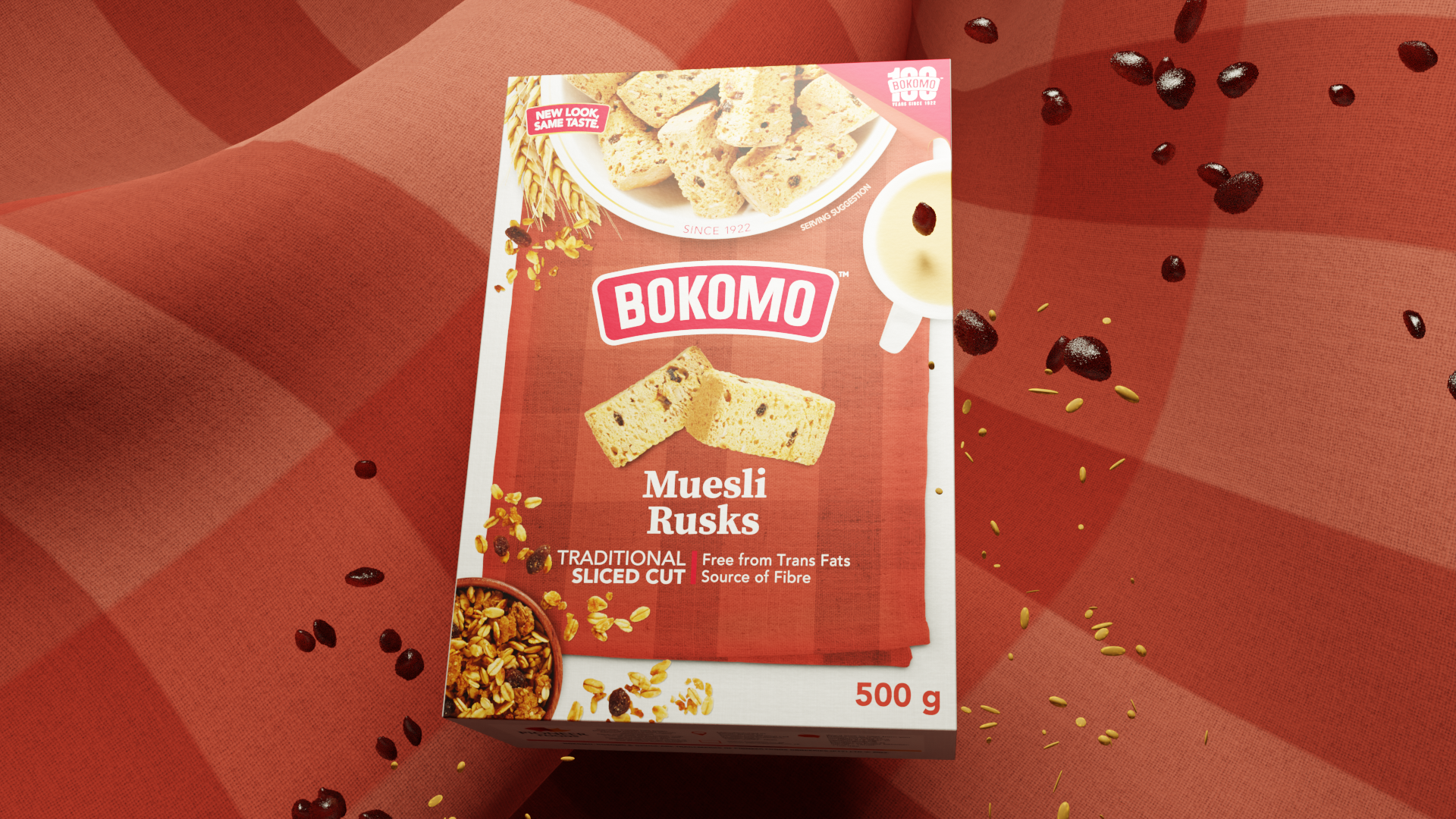
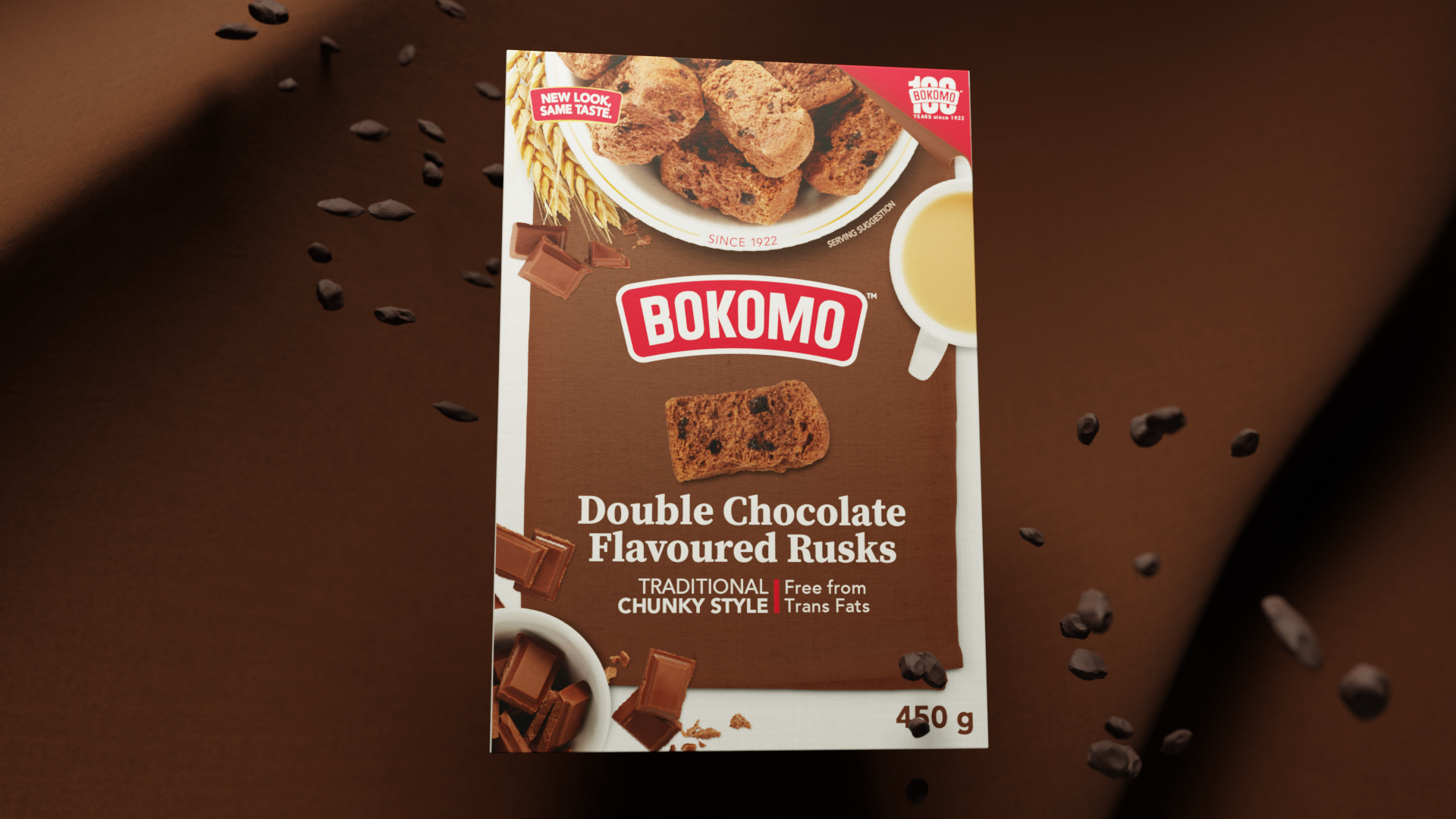
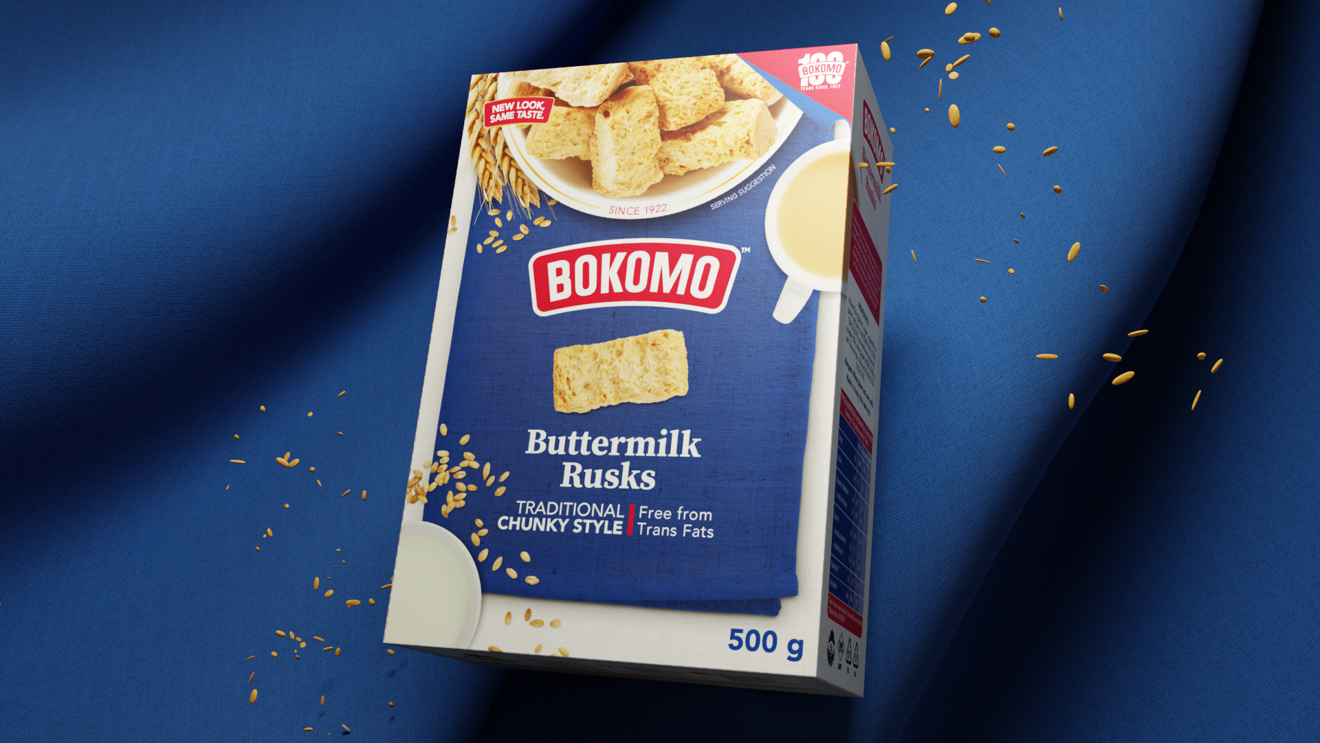
As part of a global Bokomo brand refresh, Fountainhead was tasked with rolling out the updated identity across the South African product portfolio. I was responsible for designing the packaging for the Bokomo Rusks range, creating a system that modernised the category while remaining instantly recognisable to loyal shoppers.
The previous packaging felt plain and dated, relying on simple colour blocks with little personality. My goal was to introduce warmth, appetite appeal and stronger shelf recognition without losing the familiarity of the brand.
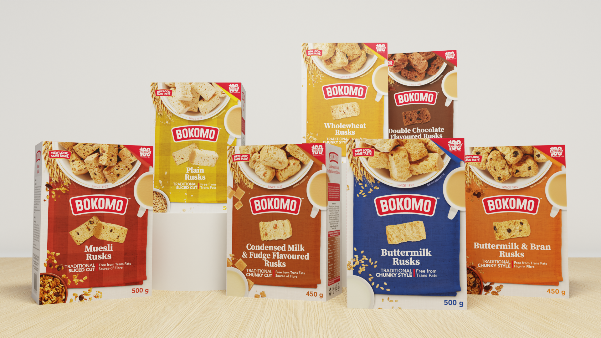
Rather than relying solely on colour to differentiate each variant, I developed a textured fabric-inspired visual system that gave every flavour its own distinctive character. Combined with refreshed typography, food photography and a cleaner information hierarchy, the range feels more contemporary while maintaining the trusted heritage of Bokomo.
The result is a cohesive family of products that balances consistency with clear variant recognition, helping the range stand out on shelf while remaining unmistakably Bokomo.
Designed as part of the team at Fountainhead Design.
ClientBokomoServicesPackaging Design